# PCM Badge Bundle
Create badges from objects or as standalone elements.
```twig
{{ job.kind.label }}
{{ job.kind.label }}
Sale 20% off
Danger!
```
# Creating badges with `BadgeableInterface`
Any object that you would like to be able to be turned into a badge must implement `BadgeableInterface`.
You can use `BadgeableTrait` to get a default implementation.
The interface specifies two methods:
- `getBadgeColour(): BadgeColour` — returns the enum case that determines the badge's colour.
- `getBadgeIcon(): ?string` — returns an [Iconify](https://iconify.design) icon name (e.g. `material-symbols:add-alert`), or `null` for no icon.
Either method can contain as much logic as you like:
```php
// Job.php
public function getBadgeColour(): BadgeColour
{
return match ($this->getKind()) {
JobKind::Investigation => BadgeColour::BLUE,
JobKind::Interrogation => BadgeColour::RED,
JobKind::Shootout => BadgeColour::BLACK,
JobKind::SipWhiskey => BadgeColour::FOREST,
default => BadgeColour::GREY
};
}
public function getBadgeIcon(): ?string
{
return null;
}
```
You then specify the object using the `:obj` prop when rendering the badge:
```twig
{# job.html.twig #}
{{ job.kind.value }}
```
## Using `BadgeableTrait`
If you only care about one of the interface methods, use `BadgeableTrait` for sensible defaults (`BadgeColour::DEFAULT` and no icon) and override only what you need:
```php
use Pcm\BadgeBundle\Interface\BadgeableInterface;
use Pcm\BadgeBundle\Trait\BadgeableTrait;
class Job implements BadgeableInterface
{
use BadgeableTrait;
public function getBadgeColour(): BadgeColour
{
return BadgeColour::BLUE;
}
// getBadgeIcon() inherited from the trait — returns null
}
```
# Standalone badges
If you just want a badge of a certain colour instead of associating it with an object, you can specify a `colour` prop instead.
```twig
Danger
```
# Props overview
A badge must contain either an `obj` or a `colour`, but not both.
`obj` - An instance of an object that implements `BadgeableInterface`. You can use either of the follow syntaxes:
```twig
:obj="job.kind"
obj="{{ job.kind }}"
```
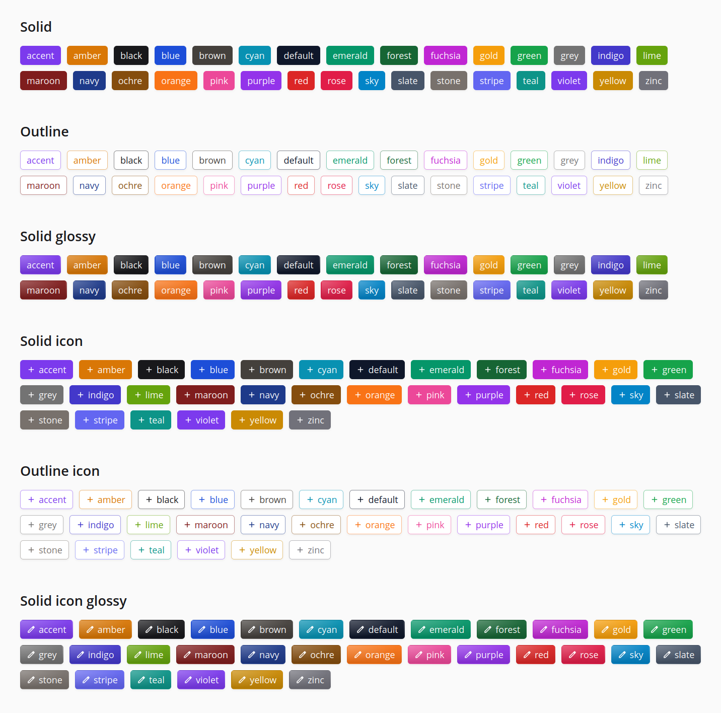
`colour` - One of the available colours specified by the `BadgeColour` enum. The palette covers the usual primaries plus tones like `cyan`, `indigo`, `purple`, `slate`, `stone`, `teal` and `violet` — see `src/Enum/BadgeColour.php` for the full list, or pass an invalid value and read the exception message.
`outline` - A boolean attribute that changes the style of the badge to an outline.
`glossy` - A boolean attribute that adds a gradient sheen to the badge. Cannot be combined with `outline` — passing both will throw an exception.
`icon` - Render an icon to the left of the label. Pass an [Iconify](https://iconify.design) name (e.g. `icon="material-symbols:add-alert"`) to use a specific icon, or pass it as a boolean (`icon`) when using `:obj` to use the icon returned by `getBadgeIcon()`. Requires `symfony/ux-icons` in the host project.
`class` - Extra classes you want to add to the badge element. These are merged with the badge base classes taking priority in case of conflicts.
`label` - Badge label text. Content inside the content block will be prioritised over the label attribute if present.
```php
{# Both of these render the same markup. #}
Warning!
```
# Config
```yaml
pcm_badge:
base_classes: "base classes here"
```
# Local development
The bundle ships with a small Symfony preview app under `dev/` that renders many different badge variants.
```bash
just composer_install # install dependencies
just serve # start the preview at http://localhost:8000
```
Edit `dev/templates/showcase.html.twig` to add or tweak variants — changes are picked up on refresh. Other handy recipes (see `justfile`):